Lab 12. Regressing toward mediocrity.
History
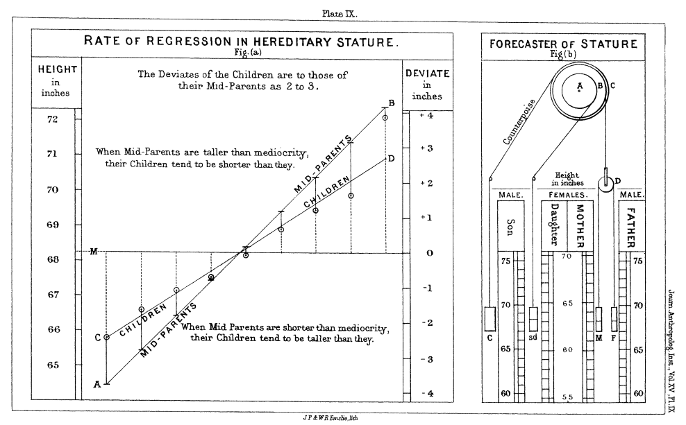
Francis Galton was the first to describe the regression line, sometime in the late 1800's.
He was practicing eugenics. Francis Galton thought it would be better if people were taller. If you're interested, see Galton's paper. Where do you "stand" on this graph of mediocrity?
 </font>
Review
We have seen regression before in this class.
You have (1) seen scatterplots, (2) ran lm() and wrote a regression line based on the output, (3) interpreted the slope, intercept, $R^2$, (4) spotted outliers.
Vocabulary
Causal effect v. association An association does not imply causal. The regression model will tell you about association between two variables.
We call these variables explanatory and response variables, unfortunately. We have the Xplanatory and the response as Y.
Once we have a linear model based on our data, we can calculated predicted or fitted values. We can subtract our predicted values from our observed values to calculate our residuals. </font>
Regression Test
We are testing hypotheses about the slope and the intercept.
Assumptions
These assumptions are different than the ones in the book. To test these assumptions, we look at graphs.
- $x, y$ linear in scatterplot
- Residuals are normally distributed.
- Independent observations
- Standard deviation of the response variables are the same for all values of x
The test itself
These are assumptions for $\beta_1$.
$H_o: \, \beta_1 = 0$
$H_1: \, \beta_1 \neq 0$
Why would we do this? </font>
library(MASS)
head(Boston)
Here's the fitted model plotted on top of the scatterplot.
library(ggplot2)
ggplot(augment_Boston, aes(nox, medv)) +
    geom_point() +
    ggtitle("Scatterplot of Median House Price v. Air Pollution") +
    ylab("Median House Price") +
    xlab("Air Pollution (Nitrogen Oxide)")

Let's fit a model. Use lm.
lm_Boston <- lm(medv ~ nox, data = Boston)
tidy(lm_Boston)
Interpret the slope.
library(broom)
library(ggplot2)
library(dplyr)
library(tidyr)
# GIVES ASSOCIATED "REGRESSION VALUES" WITH EACH COORDINATE
augment_Boston <- augment(lm_Boston)
head(augment_Boston)
Here's the fitted model plotted on top of the scatterplot.
ggplot(augment_Boston, aes(nox, medv)) +
    geom_segment(aes(xend = nox, yend = .fitted), color="darkgrey") +
    geom_point(col="midnightblue") +
    ggtitle("Look at the residuals") +
    geom_smooth(method = "lm", se = F, col="midnightblue")

ggplot(augment_Boston, aes(nox, medv)) +
    geom_point(col="darkgrey") +
    ggtitle("Look at the line") +
    ylab("Median House Price") +
    xlab("Air Pollution (Nitrogen Oxide)") +
    geom_smooth(method = "lm", se = F, col="midnightblue")

ggplot(augment_Boston, aes(sample = .resid)) +
  geom_qq() +
  geom_qq_line(col="darkgrey")

ggplot(augment_Boston, aes(y = .resid, x = .fitted)) +
  geom_point(col="midnightblue") +
  geom_hline(aes(yintercept = 0)) +
  labs(y = "Residuals", x = "Fitted values", title = "(c) Fitted vs. residuals")

reshape <- augment_Boston %>% dplyr::select(.resid, medv) %>%
  gather(key = "type", value = "value", medv, .resid)

ggplot(reshape, aes(y = value)) +
  geom_boxplot(aes(fill = type)) +
  ggtitle("Look at the variation in residuals and in the response") +
  scale_fill_manual(values = c("darkgrey", "gold"))
